Thursday, October 24, 2013

Visualizing Website Page Component Performance

Earlier this year, I did a bit of work with an analytics team working on an e-commerce site. The site allowed for a wide variety of layouts, which gave the retailer a lot of flexibility to experiment in finding the optimal page composition to maximize conversion. One of the challenges was how to evaluate the performance of components based on their page placement; some solutions included a dashboard placing numerical data on top of illustrative page layouts, but a limitation of this was that you could only see the performance for components of a single page layout at a time.

After thinking about the challenge, I came up with this potential visualization:


It color-codes components based on their relative performance (green = good, blue = average, red = poor) and places components in their relative spot on the page. For example, the layout in the top left shows the performance of five components of varying widths and height that were positioned in the top left section of the page. By distilling detailed numbers down into colored boxes representing performance and placement, one can visually identify the areas and component sizes that tended to outperform others (e.g., larger components in the top left corner outperformed components in the top right corner).

Had fun with this exercise, maybe at some point I'll get a chance to put it to use.

Sunday, March 24, 2013

Confidence Pool: Statistical Analysis

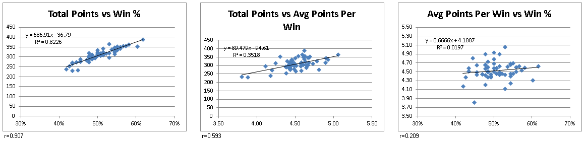
For the first piece of analysis on the pool, I did some quick checks of correlation between the participants total points and their ability to 1) predict match-up winners and 2) attribute confidence to those match-ups. So there were three variables:

  • x: win percentage (item 1)
  • v: average points per win (item 2)
  • y: total points

The correlation coefficient of x and y was .907 and the coefficient of v and y was .593. At N=58, both are statistically significant at the .001 level. That's not a surprise. But the takeaway is that the ability to pick match-ups correctly had a stronger relationship with overall performance than the ability to assign a confidence value to those picks. In addition, the correlation coefficient of x and v was .209, and therefore not statistically significant (a correlation of .45 is required at the .001 level).


For the second piece of analysis, I wanted to see whether individuals did better that could be attributed to simply picking teams to win at random. If you take a simplified view of how spreads are set by sports books, and assume that spreads are set so that there an equal number of people taking either side of the spread, picking against the spread becomes comparable to a coin flip. That is to say, picking a side should result in you being correct 50% of the time. As a result, determining whether one person's results were truly the result of being able to out-predict the sports books can be reduced to a test for the fairness of a coin.

In my pool, the winner correctly predicted the against-the-spread winner 61.7% of the time. The next closest person (who finished 6th) correctly predicted the winner 60.3% of the time. So now the question is, was this a result of being able to analyze the game better than the books, or was it just luck?

Taking a look at BL1, the pool winner, with a 61.7% prediction rate, I could make the following hypotheses:

  • H0: Participant BL1 did not better than could be expected by randomly picking teams
  • HA: Participant BL1 did better than could be expected by randomly picking teams
At a 95% confidence level, I would reject H0 if the prediction rate fell outside 1.96 standard deviations from the mean. 

Calculating the z-score for the 61.7% prediction rate over 136 games was found by:
  1. z = (.617 - .5) / SQRT(.5 * .5 / 136) 
  2. z = 2.74
So this would mean that the null hypothese should be rejected, and that participant BL1 had results that were better than picking randomly. The z-score for the participant with 60.3% prediction rate was 2.40, meaning that person also did better than could be expected by picking randomly. 

For everyone else, who fell within the acceptance region of ±0.084, we would not reject the null hypotheses, and could claim there performance was no better than random luck.

I guess that would give me some statistical smack-talk for next year, except I also fell within that interval, with 54.4% accuracy in predictions, and a z-score of 1.03.

Thursday, March 14, 2013

Confidence Pool: Leaderboard Visualizations: Part III

I had recreated the leaderboard visualization I had seen on Kaggle, and kept playing with the data set a little bit more. I started wondering how individuals performed week-to-week as compared to the weekly averages and quartiles. So I plotted this on a graph that showed the maximum, minimum, average, and 1st and 3rd quartile ranges. This was somewhat interesting, with some people oscillating wildly above and below the average (TW1, who placed 11th):


... and a couple others staying fairly close to the mean throughout the season (YO1, who placed 4th):


But I still felt that it was difficult to see how close (or far) participants were from winning, so instead of doing a week-to-week chart, I made it cumulative. This became interesting, and I saw how the winner, BL1, ran away with the pool pretty quickly:


For comparison, you can see how far away the fourth place participant, YO1, was from first place:


So this was definitely a fun data set to work with. In an upcoming post, I'll provide the Excel files along with an explanation of some of the VBA used to make the spreadsheet interactive, so people who are interested can play around with it.

Monday, March 4, 2013

Confidence Pool: Leaderboard Visualizations: Part II

Right when I started, I did some basic analysis and found that the average win percent (correct picks vs all picks) of all participants for the season was 50%, and that the average points per week for each participant was 4.5, right at the midpoint (confidence points were assigned from 1-8). So as a whole, we did no better than if picks and points were assigned randomly. The distribution for both fell fairly close to the normal distribution, with slightly higher clustering within a deviation of the mean for the average points.


I first implemented a visualization that tried to capture both the overall position of a participant, as well as their individual performance for that week. In this visualization, participants are ordered by their final finish, with color coding for their weekly and cumulative performance. For each week, the small square on the left indicates how they compared to others for that week (green = good, red = bad) and the rectangle on the right indicates their overall rank based on cumulative points. In this visualization, you can see that the top two finishers had built up enough of a lead to retain their top two spots despite bad finishes in weeks 14 and 17, and that strong performances in weeks 15 and 16 by the number six finisher (FA1) allowed him to take over the spots occupied by CR1 and JA1 (who finished 7th and 8th respectively).


I also tried implementing a visualization similar to the Kaggle visualization I liked. As in that visualization, each week represents the leaderboard for that point in time, with the shading corresponding to the final finish of the person in that position. I also added the ability to see where a particular participant finished for each week. You can see that in this case, the overall winner quickly climbed to the top couple spots and held on to that position from week 8 onward. You can see other participants with fairly steady positions as well as some others who came in to the top 10 in the final weeks.


So the visualizations were a success and I also played around with some alternate visualizations as well, including one I'll share in my next post that showed how the winner ended up running away with the pool.

Sunday, March 3, 2013

Confidence Pool: Leaderboard Visualizations: Part I

As I've been doing for the last few years, I participated in a football confidence pool last season. For the uninitiated, the basic premise of a confidence pool is that you not only need to predict the winner of a match-up, but also need to assign points to each pick based on how confident you are.

As the season progressed, and my performance oscillated wildly, I started thinking whether there were any trends or patterns in people's week-to-week performance. This is, after all, based on picks against the spread, where even the "experts" do only slightly better than 50/50.

I had a couple ideas in mind, and then I stumbled upon a Kaggle challenge to provide visualizations of leaderboards. After reviewing them, and noticing that quite a few of them used variants of a line chart, which could quickly become confusing with large data sets, I gravitated towards a heatmap representation provided by one participant.


What I liked about this was that it was pretty easily digestible and that you could start to identify trends in performance over the course of the competition. In the interactive version you can click on individual entries to see the performance over time of a specific entry highlighted.

So I thought I would do something similar with the leaderboard of the confidence pool, and see if there were any trends. I'll share my results in the next post.

Sunday, February 24, 2013

Why this blog?

It all started when I read an article in the Harvard Business Review entitled "Data Scientist: The Sexiest Job of the 21st Century." A light bulb went off in my head as I realized that this was a field I wanted to learn more about, as the core skills of analysis, programming, and presentation that are required to be a successful data scientist are activities I enjoy and am actually pretty good at.

Since then, I've been reading a lot about the field and trying to get my hands dirty in the tools I haven't used yet, while continuing to learn about statistics and visualization. This blog is meant to help me with that. The specific goals of this blog are:

  1. Give myself a chance to do more experimentation with data analysis and visualization
  2. Force myself to be more rigorous in my thought experiments and data  projects... I've started projects only to put them on hold when something more interesting came up or things got too busy at my day job
  3. Share my experiences with others who may also be new to the field, in the hope that they might be able to learn from me
  4. Explore Excel-based visualizations as an alternative to some of the packages that are out there
I hope you enjoy reading and maybe learn something from my journeys in data science.